My friend said his shirt is blue. I said, it’s cobalt. He said, that means blue, right? And I’m all, yeah, but it’s specific. And he’s all, ok, you keep busy being specific about my shirt and I’ll keep busy eating this here fish sandwich. And then I go, it’s pecan crusted catfish on black olive foccacia. And he’s all, like I said, fish sandwich.
You know what this art piece is? It’s 1,200 fish sandwiches.
Interesting Fact: The Dani people in Southern Indonesia have only two words used for color, roughly translating to day/light and night/dark.
Another Interesting Fact: Research indicates most American children, on average, learn 11 standard color terms by the age of five; red, orange, yellow, green, blue, purple, pink, brown, black, white, and grey. Eleven. That’s a lot more than the peeps in Indonesia, but eleven is surely sub sufficient. People, I ask you: WHO WILL TEACH OUR CHILDREN MAGENTA?
So the question is; why must creative types like us always divide and conquer our colors? Why must we label and compartmentalize something as delicate and wonderful as the petal of a flower, or the color of the sky before the storm? Of course, some product pushing sales departments do it to describe their wares and maybe even boost sales (would you rather buy a lipstick called 45605C, or Juniper Sunrise?)…but I tend to think there is something bigger underneath it all.
Of all the colors that intrigue and perplex, yellow is the top of my list. Our associations are so extreme and contradictory; it’s the color of sunshine and happiness in our culture, while in many parts of Asia, yellow is the color illness and grief. To me, yellow means school buses and rubber duckies and buckets of buttery popcorn. It means tennis balls and taxi cabs and the convertible sports cars of men in a mid-life-crisis. It’s the cautious color of street signs and crime scenes. Watch an old Western Movie and you can’t go five minutes without someone getting called a cowardly “yellow belly.” It’s even an ethnic slur. We have so many interpretations of this color, I thought it would be interesting to see if our perceptions carried through in our names. Internet, meet 1,200 names for yellow.
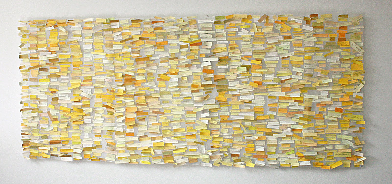 |
| They say Eskimos have 18 names for snow. This is 1,200 names for yellow. Every single swatch falls within “yellow” on the color spectrum, as defined by Maerz Paul’s “A Dictionary of Color” 1930| McGraw-Hill| New York |
She’s rather old. Born 2003, just as I was finishing up at Le Super Pretentious Art School. At the time, I thought it was right to give her an equally pretentious name; Ekphrasis: Yellow: Nomenclature. Seriously, I just buried my face in my hands after typing that. I can’t believe I was ever so full of myself to name a piece with not only one but TWO colons! And not only one but TWO words that don’t even appear in standard dictionaries. From Wiki:
Ekphrasis is the graphic, often dramatic description of a visual work of art. In ancient times it referred to a description of any thing, person, or experience. The word comes from the Greek ek and phrasis, ‘out’ and ‘speak’ respectively, verb ekphrazein, to proclaim or call an inanimate object by name.
Nomenclature is a term that applies to either a list of names and/or terms, or to the system of principles, procedures and terms related to naming – which is the assigning of a word or phrase to a particular object or property.
So, really, I should have named her Bigass List of Names for Yellow.
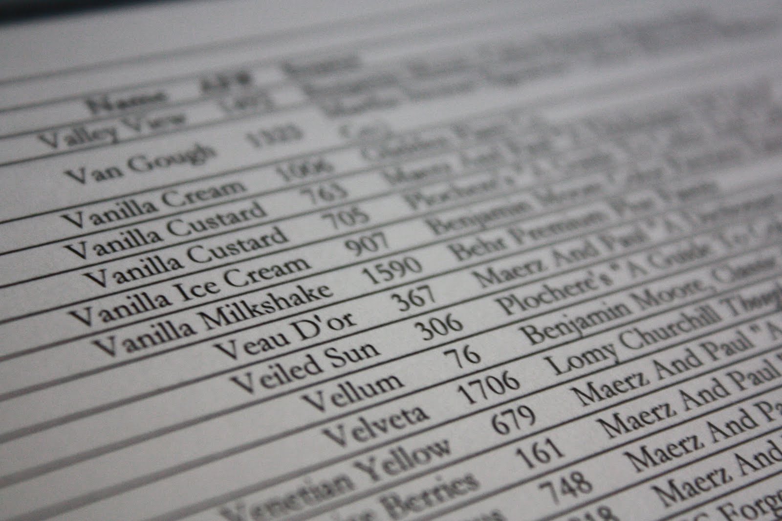
And while I scoff at the idea of it now, it seemed a pretty good idea back then. Half the swatches came from typical sources like paint manufacturers, apparel catalogs, botanical guides, cosmetic companies, etc. The other half came from myself and a group of friends who made our own color identities (“ooo! this yellow is the color of my friend Karen’s Labrador, let’s name it after him” and suddenly Duncan 878 was born)….they were all recorded and referenced in a 42 page catalog no one will ever find interesting but me. But that’s Ok. I’m cool with that. I know the ‘real art’ is the catalog and not the thing on the wall. I like my catfish sandwich, no matter what you call it.
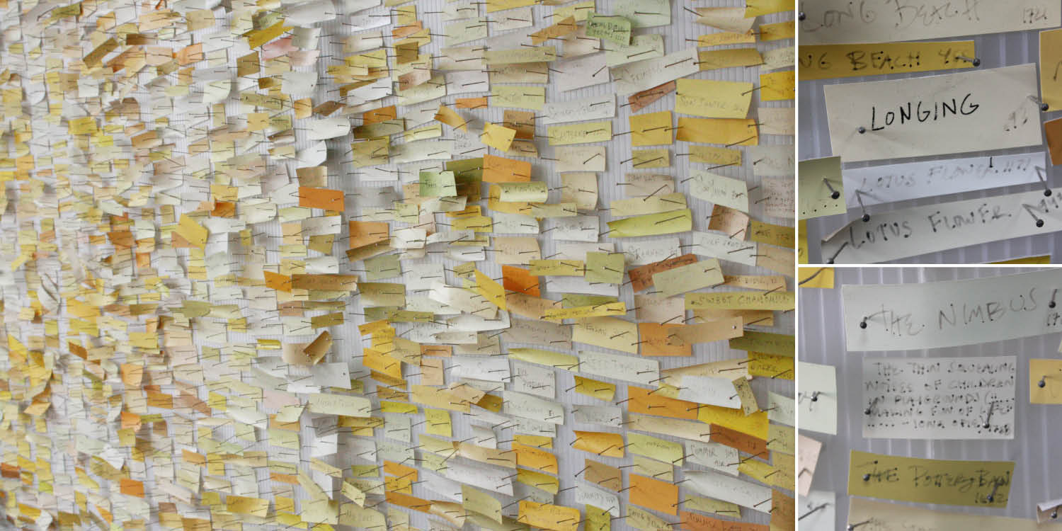 |
| I love the center swatch on the bottom right image, named “The Thin Squealing Noises of Children on a Play Ground Making Fun of Life” courtesy of Iona O. |
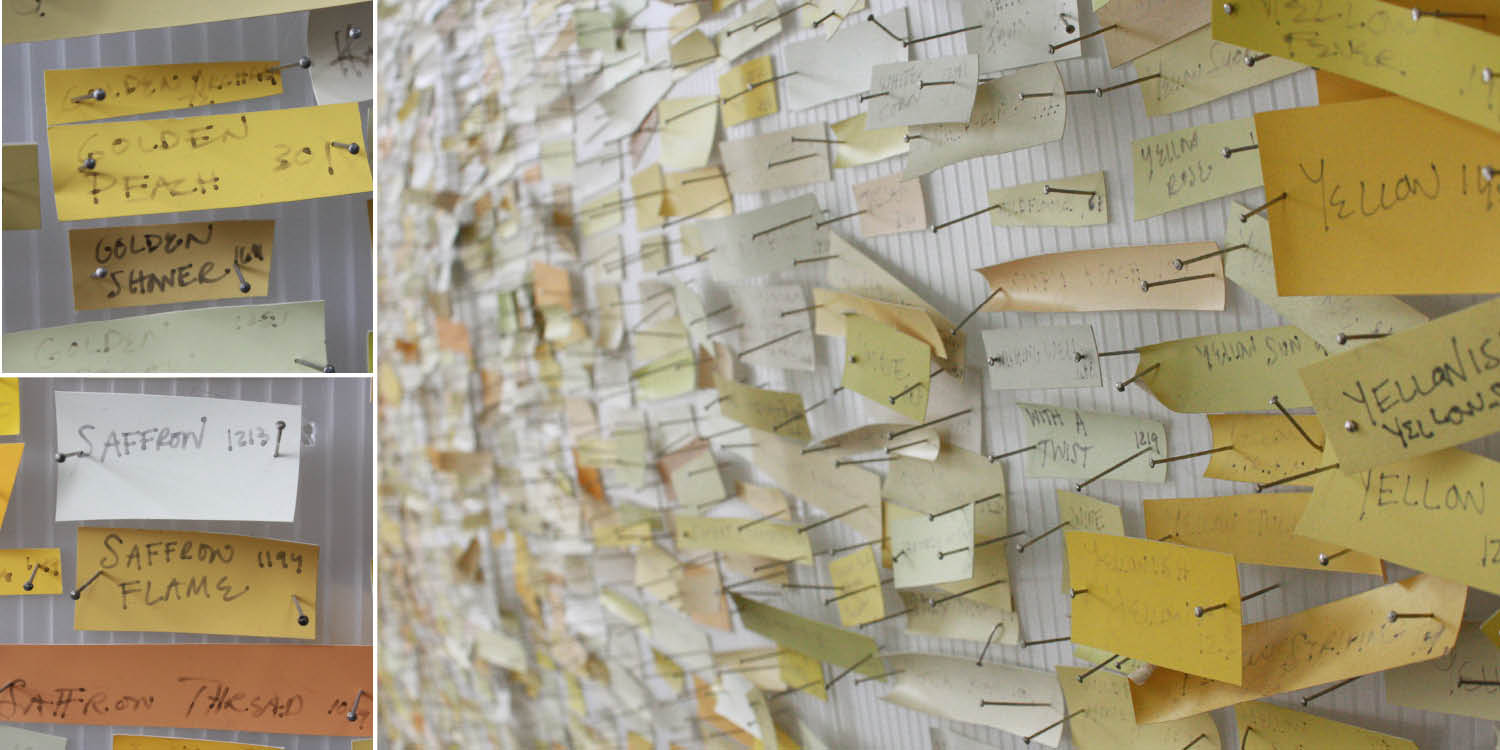 |
| Notice lower left square contains three colors containing the term Saffrom, but they are nothing alike. |
The colors came from all sources, including a number of anonymous visitors who saw it in a gallery in 2004. Some really interesting stuff came out of the wood work… Golf Leaf, Nacho Cheese, Julie Andrew’s Underwear, French Pink, Forsythia, Yosemite, Pigskin, Polar Bear, Moon Dance, Murmur, Chicken Liver, Liberia, Little Dipper, Yellow Matter Custard Dripping From a Dead Dog’s Eye, Butter Finger, Ugly Deposits of Nicotine On Fingers And Teeth, That 70’s Color, Forbidding Skies…
It was fun. I have enjoyed her for many years. Now the time has come to say goodbye.
My office is moving. Sigh. As much as I love it here, nestled on a perch above the train tracks, we are moving offices a few blocks down. Upside: I’ll swap my view of the train tracks for a gorgeous Chagall mosaic. Downside: less wall space. This means my gigantic art piece will be coming down. I have no space for her at home, so before banish her to a box in the dark, I thought I would share her with you and give her one last day in the sun. Thanks for looking 🙂
New Project: Starting on September 21st (my birthday) I’m starting something new! Over the next couple weeks I’ll be painting my own color swatches and sticking them into a drawer next to my bed. Every night I plan take a new swatch card out and give it a name. Perhaps on the back I’ll write the date and what inspired me to give it that name. Or maybe not. I don’t know. This isn’t a manifesto, just an exercise in creativity and a way to eventually look back and survey a year through bits and pieces of color. Anyone else who feels like joining in the party, feel free. This could be the start of something interesting….